From Monochromatic to Rainbow: A Guide to Choosing the Perfect Aesthetic Color Palette
Whether designing a website, creating an art piece, or planning your home decor, choosing the right color palette is crucial. Colors have the power to evoke emotions and set a certain mood for any design.
In recent years, there has been a rise in the popularity of aesthetic color palettes, a combination of colors that create a cohesive and visually appealing look.
In this guide, we will take you through the journey from monochromatic to rainbow color palettes and help you choose the perfect aesthetic color palette for your next project.
The Different Types of Aesthetic Color Palettes
There are several types of aesthetic color palettes, each with its unique style and purpose. Let’s take a closer look at some of the most popular ones.
Monochromatic Color Palette
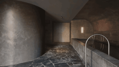
The monochromatic color palette is based on a single hue, with different shades and tints of that particular color. This color scheme is often seen in minimalist designs and gives off a clean and sophisticated vibe. It’s perfect for those who want to create a calming and understated aesthetic.
To create a monochromatic color palette, you can start with one hue and then use lighter or darker shades of that color to add depth and dimension. You can also use a color wheel to help you find complementary colors within the same hue.
Analogous Color Palette
Analogous color palettes are created by choosing three colors next to each other on the color wheel. This color scheme is often seen in nature and can make a harmonious and soothing effect.
When choosing an analogous color palette, consider the intensity and saturation of the colors you’re using. It’s best to stick with colors that are similar in tone for a more cohesive look.
Complementary Color Palette
Complementary color palettes are made up of two colors opposite each other on the color wheel. This color scheme is often used in high-contrast designs and can create a bold and eye-catching look.
To avoid overwhelming your design, it’s best to choose one dominant color and use its complementary color as an accent. This will create a balanced and visually appealing aesthetic.
Triadic Color Palette
A triadic color palette is created by choosing three equidistant colors on the color wheel. This color scheme can create a vibrant and energetic look and is often used in more playful designs.
To ensure a well-balanced triadic color palette, use one dominant color and incorporate the other two colors as accents. You can also adjust the saturation of the colors to create a more cohesive look.
Tetradic Color Palette
A tetradic color palette is made up of four colors that are evenly spaced on the color wheel. This color scheme can be challenging to pull off, but it can create a visually striking and dynamic aesthetic when done correctly.
When using a tetradic color palette, it’s essential to choose one dominant color and then use the other three colors as accents. You can also try using different shades of the same hue to create a more subtle effect.
Rainbow Color Palette
Rainbow color palettes are often associated with bright and cheerful designs. This type of color scheme incorporates all the colors of the rainbow – red, orange, yellow, green, blue, indigo, and violet.
While this color palette may initially seem overwhelming, it can be a fun and playful choice for unique projects. When using a rainbow color palette, balance out the colors using white or black as a neutral base.
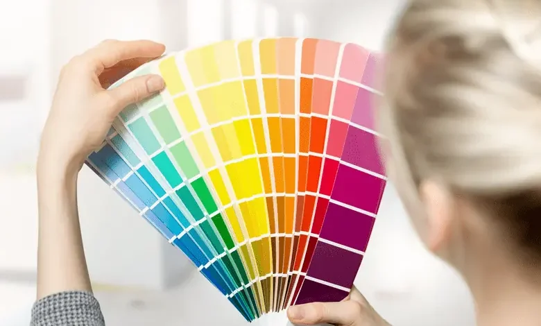
How to Choose the Perfect Colors
Now that you better understand the different types of aesthetic color palettes, it’s time to choose the perfect colors for your project. Here are some tips to help you make the right decision:
Consider Your Brand or Theme
Choosing colors that align with their values and message is essential if you’re creating a design for a brand or specific theme. For example, earthy tones may work well for a sustainable brand, while bold and bright colors may fit a children’s party theme more.
Think About the Mood You Want to Create
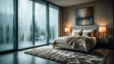
Colors have the power to evoke emotions and set a certain mood. Do you want your design to feel calm and serene? Then, opt for cool tones like blue and green. Do you want your design to feel bold and energetic? Then, choose warmer tones like red and orange.
Consider the Space
Consider the space you’re working with if you’re choosing a color palette for your home decor. Dark colors can make a small room feel even smaller, while light colors can open up a space and create an illusion of more extensive space.
Experiment and Trust Your Instincts
Choosing the perfect color palette is a creative process, so don’t be afraid to experiment and trust your instincts. Play around with different hues and shades until you find the perfect combination that speaks to you.
But if you’re not confident in your color-choosing abilities or don’t have the time to plan and execute a perfect aesthetic color palette. In that case, you can always seek help from professional painting contractors.
They have the expertise and experience to help you choose the right colors for any project. Plus, they can take care of all the painting work, leaving you with a beautiful and cohesive aesthetic.
Seek Inspiration
If you’re stuck and can’t develop an aesthetic color palette that works for you, seek inspiration from various sources. You can browse through design blogs Pinterest boards, or even take a walk in nature and observe the colors around you.
Finding the perfect aesthetic color palette can be a daunting task, but it’s also a fun and creative process.
Choose the Perfect Aesthetic Color Today
From monochromatic to rainbow color palettes, each has its unique appeal and can create a different mood and aesthetic. By following the tips above and staying true to your style, you can choose the perfect aesthetic colors for any project.
Whether you keep it simple with a monochromatic palette or go bold with a rainbow palette, remember that, ultimately, it’s all about creating a visually appealing and cohesive design.
So go ahead! Experiment, have fun, and let your creativity shine through!
Did you find this guide helpful? If so, check out our other articles for more design tips and tricks!